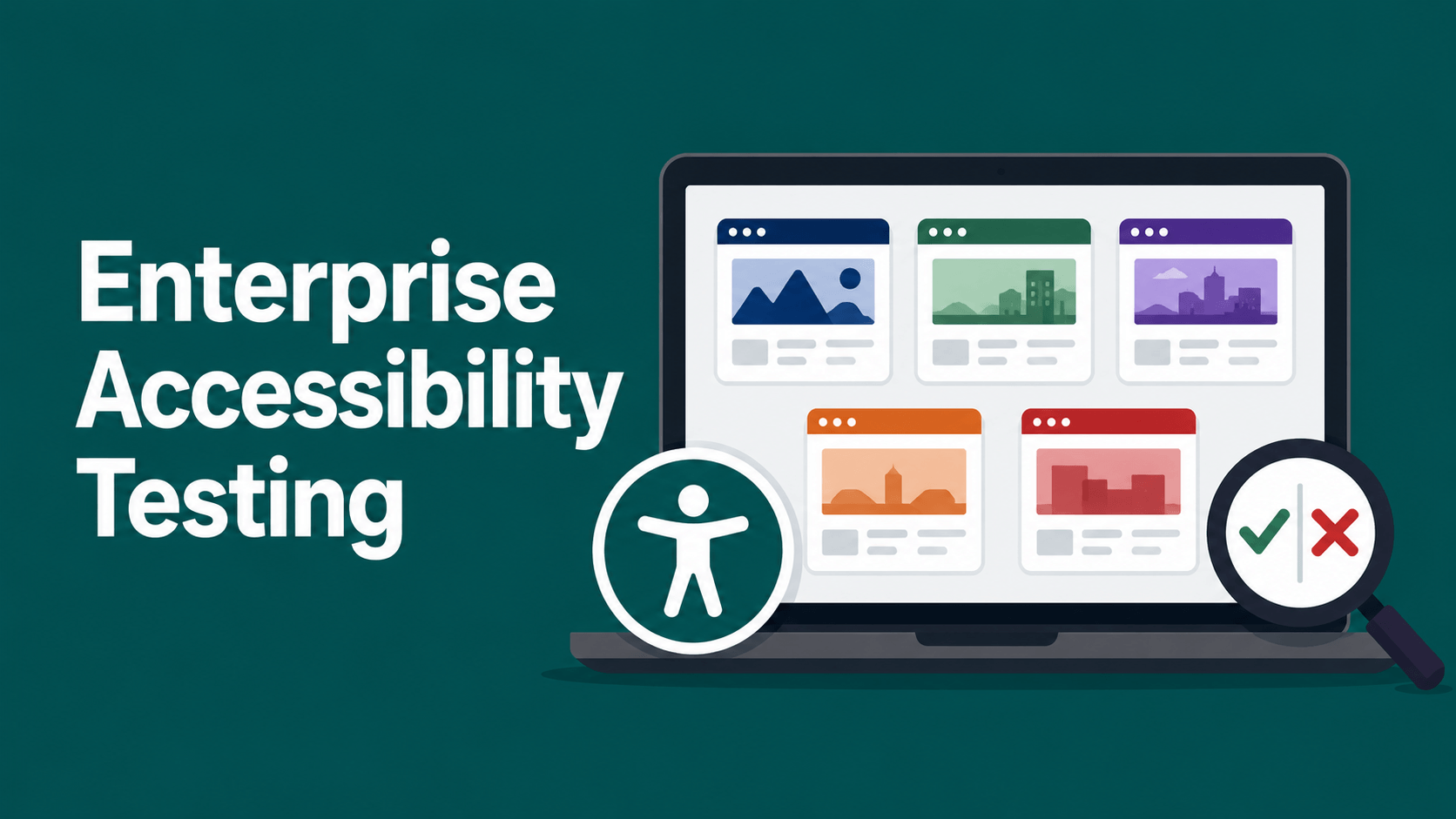
Five enterprise websites. One blind user. A screen reader as the only interface. I ran this test across five major global brands using NVDA and JAWS over two weeks, navigating each site the way I navigate every website every day: without a mouse, without sight, and without patience for barriers that should not exist. What I found was not surprising. It was frustrating in a very familiar way.
Having spent fifteen years navigating the commercial web through a screen reader as an enterprise marketer, I know exactly what these failures sound like. This is what I found.
How I Tested
I tested each site using NVDA 2024.4 in Firefox and JAWS 2025 in Chrome, navigating by keyboard only: Tab for interactive elements, H to jump between headings, F for forms, and B for buttons. Both screen readers were used because they handle some interactions differently. A page that passes in one can still fail in the other. For a full breakdown of how the two compare, see NVDA vs JAWS: key features and use cases explained. Three tasks per site: find the main service or product offering, locate the contact or sales page, find a resource such as a whitepaper or case study. Each site was scored on five criteria: heading structure, image alt text, form labelling, button naming, and keyboard navigation continuity. Each criterion received a pass, partial, or fail rating. Companies are not named. The purpose is to document patterns of failure across enterprise digital estates, not to publicly shame individual organisations. Five sites is a small sample, but the patterns I found match what WebAIM found across one million home pages, which is why I am confident they represent the industry rather than outliers.
Site One: Large IT Services Company
Heading structure: Pass. Clear H1 and logical H2 flow through service areas. Navigating by heading gave me a meaningful map of the page.
Image alt text: Partial. Hero images had descriptive alt text. Decorative icons were correctly tagged with alt=””. However, three data visualisation images in the Insights section had no alt text at all. Those images were conveying information: percentages, comparisons, trend lines. That information was completely inaccessible to me.
Form labelling: Fail. The contact form had four fields. None of them had visible labels my screen reader could detect. NVDA announced each field as “edit” with no indication of what information was expected. I had to guess based on visual context I could not access. A sighted user filling in name, email, company, and message would complete this in under a minute. I spent four minutes working through it and still could not confirm I had filled it correctly.
Button naming: Partial. Primary CTA buttons had descriptive text. A “Download Report” button in the resources section was labelled only as “Download” with no indication of which report.
Keyboard navigation: Pass. Tab order was logical. Focus indicators were visible.
The form labelling failure is the one that costs this site real conversions from screen reader users who cannot complete it.
Site Two: Major Cloud Platform Provider
Heading structure: Fail. The homepage jumped from an H1 to H4 headings with no H2 or H3 in between. When I navigate by heading, I get a list of all headings on the page. This one gave me a single H1 followed by eleven H4s. I had no structural sense of what the page contained or how sections related to each other. It sounded like a random list of disconnected phrases.
Image alt text: Pass. Images were well-described throughout. Partner logos had meaningful alt text identifying the partner, not just “logo”.
Form labelling: Pass. The demo request form had fully labelled fields and an accessible error state. When I left a required field empty and submitted, NVDA announced the error clearly and moved focus to the problematic field.
Button naming: Fail. The site used icon buttons throughout its product navigation. A row of five icons with no text labels. NVDA announced them as “button, button, button, button, button.” No aria-label attributes. No accessible names at all. I could not determine what any of them did without switching tools and trying each one to see what happened.
Keyboard navigation: Partial. I could navigate the main content but the top navigation mega-menu was a trap. Tabbing into the menu opened a flyout that required hovering to keep open. Keyboard users cannot hover. The menu collapsed every time I moved focus within it, sending me back to the start of the navigation every attempt.
Strong on alt text and forms. The mega-menu keyboard trap and the unlabelled icon buttons block core site functions that a sighted user would never notice were broken.
Site Three: Global Consulting Firm
Heading structure: Partial. The main content areas used headings correctly. The sidebar and footer used headings as styling tools rather than structural markers. H3 elements were applied to footer category labels and social media link groups. Not a critical failure but it adds noise when navigating by heading.
Image alt text: Fail. This was the worst image alt text I encountered across all five sites. Thought leadership article thumbnails had alt text that was either the article title repeated verbatim or generic labels like “article image” or “author photo”. The author photos were tagged “profile image” with no name. When I navigate a list of articles by image to orient myself, I need to know who wrote the piece. “Profile image” gives me nothing.
Form labelling: Pass. The newsletter signup and contact forms were clean. Fields were labelled. Required indicators were announced. Submission confirmation was accessible.
Button naming: Partial. Most buttons were descriptive. One “Read More” button appeared seventeen times on the insights page with no differentiation. Seventeen separate elements all announcing as “Read More button”. NVDA users navigating by button get a list of all buttons on a page. A list of seventeen identical entries is unusable.
Keyboard navigation: Partial. A cookie consent modal appeared on first visit with two options. Tab focus did not enter the modal. I had to use a workaround to reach and dismiss it, which is not a solution for users who do not know the workaround exists.
The repeated “Read More” button pattern is one of the most common failures on enterprise content sites and one of the easiest to fix. Every link needs a unique accessible name.
Site Four: Enterprise Software Company
Heading structure: Pass. The cleanest heading structure of the five sites. Logical hierarchy, descriptive headings, and navigating by heading gave me an accurate mental map of the page content.
Image alt text: Pass. Product screenshots had detailed alt text describing what was visible in the interface. Marketing illustrations were tagged appropriately as decorative where they were purely visual.
Form labelling: Pass. The demo request form and the contact form were both fully accessible. Error states were announced. Field-level help text was associated with its field using aria-describedby, which meant it was read by NVDA when I landed on each field rather than requiring me to find it separately.
Button naming: Pass. Every button had a clear, descriptive accessible name. The “Schedule a Demo” CTA appeared in multiple places and was consistent. No ambiguous “Click Here” or “Submit” without context.
Keyboard navigation: Fail. The product tour section was built entirely with JavaScript interactions that had no keyboard equivalents. Tab stopped working when I entered that section. NVDA had nothing to read. I could see from the heading list that content was there. None of it was reachable by keyboard. An entire product showcase, inaccessible.
The strongest site of the five on most criteria. The JavaScript section failure is a single engineering decision that blocks screen reader users from accessing a core marketing asset. It is also the easiest type of failure to prevent at build time.
Site Five: Major Financial Services Platform
Heading structure: Fail. No H1 on the homepage. The page title was styled to look like a heading but was marked up as a paragraph element. From a screen reader perspective, the page had no primary heading at all. I could not determine what the page was about from its heading structure alone.
Image alt text: Partial. Product images had alt text. Icons were inconsistently handled: some tagged as decorative, some with alt text, some with no alt attribute at all, which causes NVDA to fall back to announcing the filename.
Form labelling: Fail. The account creation form had eight fields. The visible labels were CSS-based placeholder text that disappeared when I focused the field. NVDA could not detect them. I was filling in fields with no indication of what each field expected. Password requirements were visible only on hover, which is not a keyboard interaction, and were never announced by the screen reader.
Button naming: Fail. The account creation flow included a step with three plan options presented as cards. Each card had a “Choose Plan” button. All three buttons had the identical accessible name. My screen reader announced “Choose Plan button” three times with no way to distinguish between them.
Keyboard navigation: Fail. A session timeout modal appeared after two minutes of navigating. It had a 30-second countdown and two buttons: “Stay Logged In” and “Log Out”. Tab focus went to the modal but could not reach either button. The countdown completed and the session ended. I could not prevent it.
The most barriers of any site I tested. The form labelling failures alone would prevent a blind user from creating an account independently. The session timeout trap would terminate their session if they paused to use their screen reader. These are not minor inconveniences. They are complete access blocks on core user journeys.
The Patterns That Appeared Across All Five Sites
Three failures appeared on at least four of the five sites I tested. Unlabelled or ambiguously labelled interactive elements, including buttons, links, and icons, were present on four sites. Cookie consent modals that did not receive keyboard focus were present on three sites. Interactive content built in JavaScript with no keyboard equivalents appeared on three sites.
These are not new problems. They are not obscure edge cases. The WebAIM Million 2026 report found that 96 percent of detected accessibility failures across one million home pages fall into just six repeatable categories. What I found across five enterprise sites matches that pattern exactly. The failures are known. The fixes are documented. The implementation is not happening. If you want to understand what these failures cost your business in revenue, legal exposure, and SEO performance, the numbers are laid out in detail in the real cost of having an inaccessible website.
What This Means for Enterprise Development Teams
Every failure I documented above has a fix. Form labels require a label element or an aria-label attribute. Icon buttons require an aria-label. Duplicate link text requires a visually hidden span or aria-label with a unique name. Heading hierarchy requires a document structure review at the wireframe stage, not after launch. JavaScript interactions require keyboard event handlers built in parallel with mouse handlers.
None of these fixes require a rebuild. None of them require a new CMS or a new design system. They require the development team to know what the failures look like and have a process for catching them before they ship. That is what accessibility testing with a real screen reader user provides that automated scanners cannot. For the broader picture of where AI is taking enterprise accessibility and what teams should be doing now, I have covered that in how AI is making the digital world more accessible and what enterprises must do now.
If you are a digital leader reading this and you have not had a blind user test your website, here is the one thing to do this week: download NVDA for free, close your eyes, and try to complete your own contact form using only the keyboard. If you cannot do it in under two minutes, your users cannot do it either. For organisations that need this done at scale, specialist firms offer blind user testing as a standalone service where testers who use JAWS and NVDA daily navigate your site and document exactly what breaks.
Frequently Asked Questions
What is the most common accessibility failure on enterprise websites?
Unlabelled interactive elements are the most consistent failure across enterprise sites. Buttons without accessible names, icon-only navigation with no aria-label, and identical link text used for different destinations all prevent screen reader users from understanding and using core site functions. These appear in some form on the majority of enterprise websites tested with assistive technology.
Do automated accessibility scanners catch all the issues a screen reader user encounters?
No. Automated scanners detect between 30 and 40 percent of real-world accessibility barriers at best. The remaining 60 to 70 percent is where lawsuits, complaints, and genuine user friction live. Issues like illogical tab order, keyboard traps in interactive components, and session timeout modals that do not receive focus are invisible to automated tools and require manual testing with assistive technology to identify.
What screen reader should enterprise teams use when testing their websites?
Testing with NVDA in Firefox and JAWS in Chrome covers the two most widely used screen readers among blind and low-vision users. NVDA is free to download. JAWS requires a paid licence, though Freedom Scientific offers a 40-minute trial mode for evaluation. Both should be tested because they handle some edge cases differently, and a page that works in one may still break in the other.
How does a missing H1 tag affect a website for screen reader users?
When a page has no H1, screen reader users navigating by heading have no primary landmark to orient from. They cannot determine what the page is about from its structure alone. For keyboard users who rely on heading navigation to skip through long pages, the absence of a logical heading hierarchy means reading every element on the page sequentially, which is time-consuming and disorienting.
Are accessibility overlays and widgets sufficient for enterprise compliance?
No. Accessibility overlays do not resolve underlying code-level barriers. In the full year of 2025, 983 ADA lawsuits were filed against websites that already had accessibility widgets installed, according to EcomBack’s annual report. Real compliance requires fixing the source code: heading structure, form labels, button names, and keyboard handlers. Layering a third-party script on top of inaccessible markup does not fix it.
What is the single highest-impact accessibility fix an enterprise website can make?
Form labelling consistently delivers the highest user impact per fix. Unlabelled form fields prevent screen reader users from completing contact, registration, and conversion flows entirely. Adding a label element or aria-label to each field requires minimal development time and immediately makes core user journeys accessible to keyboard and screen reader users who were previously blocked.